A Product Designer's Guide to Effective Data Visualization
Designing data-heavy products that users will love
A core skill in design is being able to translate complex ideas into intuitive experiences. This is where designers leverage user insights, design patterns, and visual strategy to seamlessly guide users through interfaces and interactions. As a Product Designer at Expedock, I’m responsible for turning raw logistics data into insights and visualizations that drive our customers’ business decisions. In this article, I document some learnings while designing for our freight business intelligence platform.
1. Observe how the user would go through the data.
To create effective data visualizations, watch how someone would go through their current report that you’re trying to redesign or improve. Who is the report for and why do they need it? What questions do they need to answer? What do they need to see in the report? This gives you an opportunity to understand what they were thinking when analyzing a specific chart, why they paused, etc. Ultimately, observing users allows you to identify how to present data in a way that aligns to their analysis behavior and goals.
An example of this at Expedock is showing delayed shipments data. The user would ask a series of questions:
Are there delayed shipments?
How many are delayed?
Which shipments are these?
How long have they been delayed?
Why are they delayed?
Who is responsible?
Following this sequence, you can first present the total delayed shipments to give them an overview but create an affordance for the user so they can dig deeper to answer the rest of the questions. This way, you guide their train of thought when analyzing reports.
2. Get out of the way of the user.
As designers, sometimes we overcomplicate an interaction or page with the intent of condensing information when instead we should keep it in its vanilla form. An example of this is when I was designing a chart to show the volume for three different categories. I thought showing a summary view would be smart. However, when I showed it to our proxy users, they didn’t know where to look, the proposed design didn’t match their current mental model, they felt overwhelmed with the amount of data in one chart, and worse, they didn’t know how to analyze from that chart.
Here, I learned that breaking something down might mean that the user will look at more things, but they are much easier to understand.
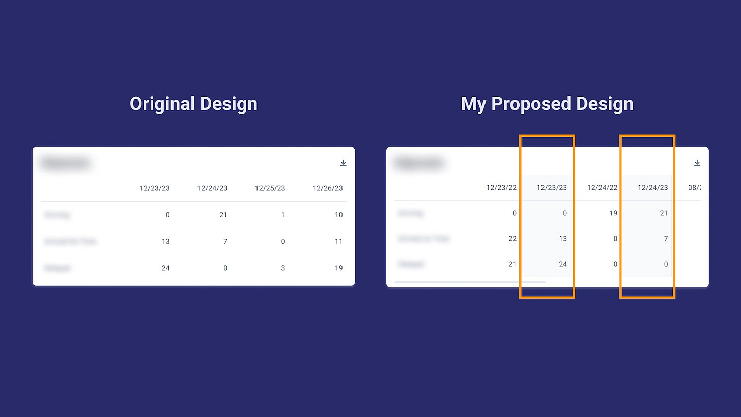
Another example of this is for tables. We needed to add the previous period values to the table. I added these previous period values beside the current period values. Casper, our VP of Product, spotted a flaw in this proposal. While I made it easier for users to scan, I made it more difficult for them to dig deeper if they needed to do further analysis.
What’s wrong with this design?
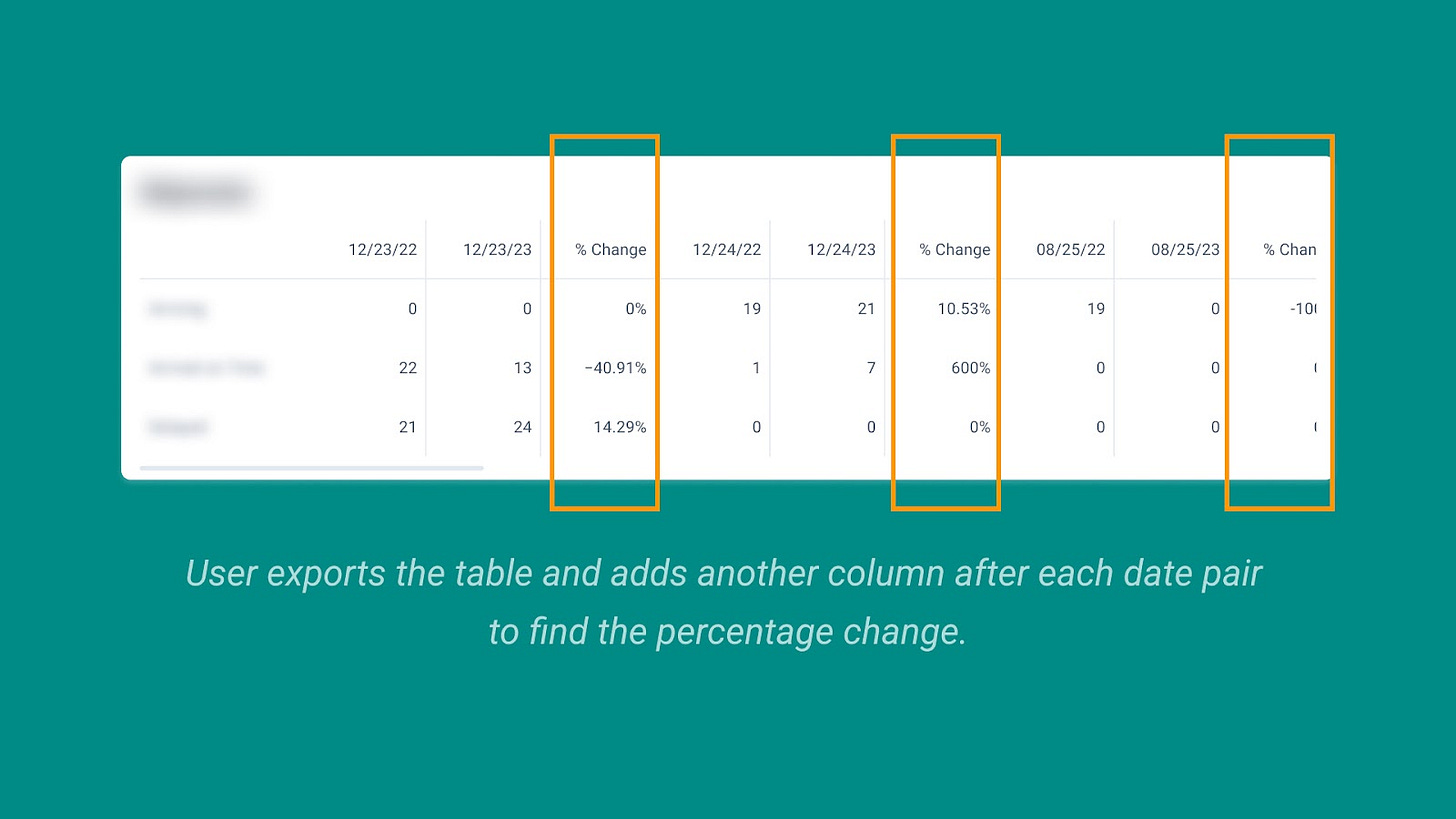
This is not the ideal design because when the user wants to export the table and add the percentage change, they would have to insert a new column beside each pair (current and previous period values). This makes the analysis harder and I basically just made it more complicated for the user to tinker with the data on their own. See what I mean below:
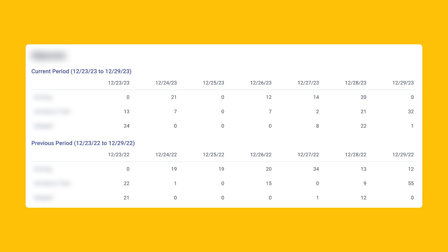
Learning from this, I instead separated the data into two tables. That way, we present what users need without blocking them, should they need to analyze further.
3. Reduce repetitive info.
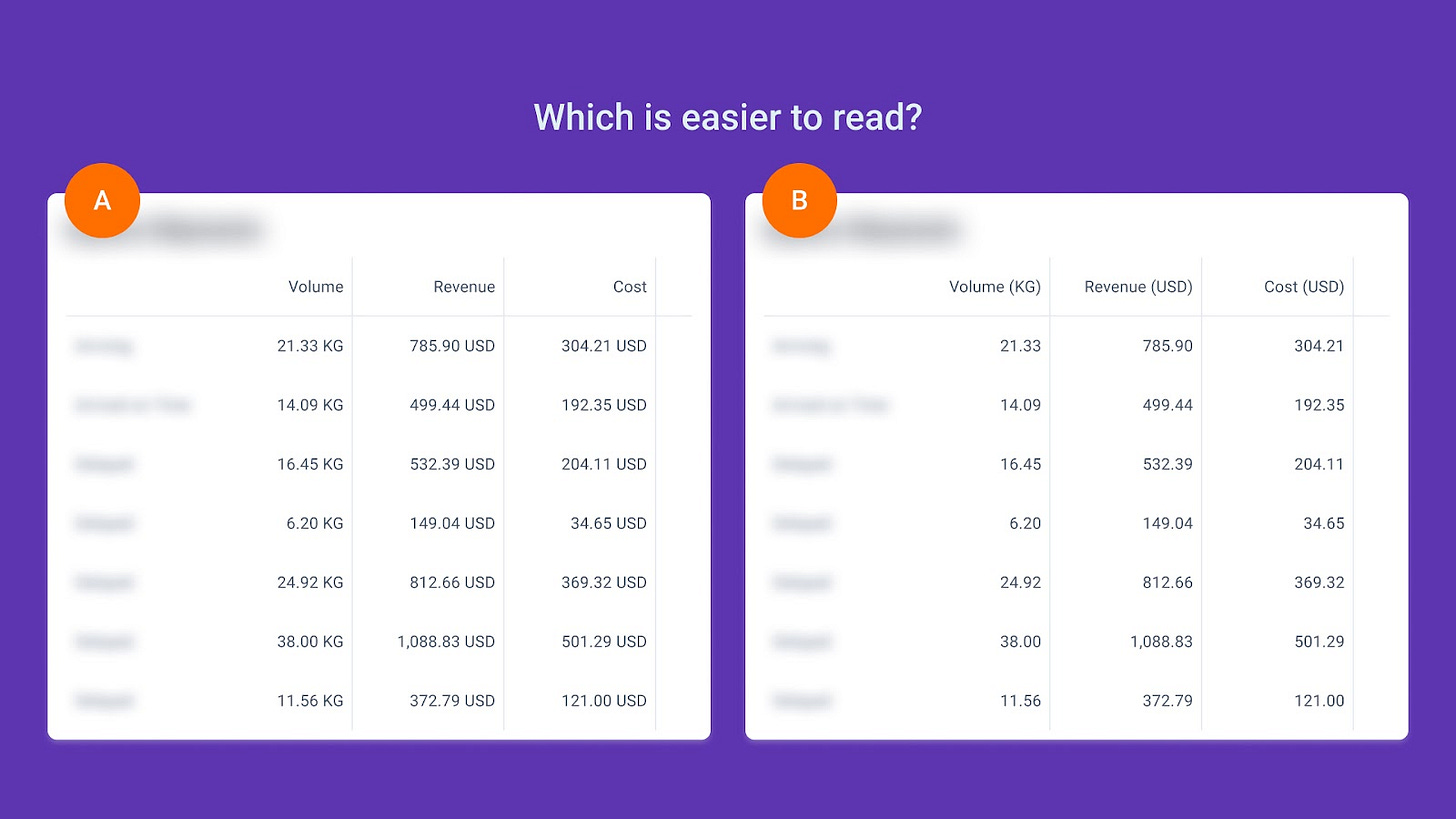
When designing tables and charts, we can reduce cognitive load by showing redundant content only once. An example of this is measurement units. Instead of placing the unit beside each value, we can put it beside the header cell so users can just focus on the numbers.
4. Look at how other platforms present similar data.
Just like looking for pegs in logo or website design, whenever I’m unsure about how to execute a specific visualization or feature, I would refer to tools like Google Analytics, Mixpanel, and Metabase. While the use case is different, you can find common principles and patterns to reference on.


5. Consult data science experts.
At Expedock, I would seek guidance from engineers and PMs who have a strong data science background. They would give me advice on how to present the data more effectively and what other types of visualizations I can use. I highly recommend integrating this approach into your workflow, especially when seeking constructive feedback on data visualization projects.
Conclusion
In my role as a Product Designer at Expedock, I've adopted these frameworks that influence my design choices when crafting data products. Figuring out how users analyze data, making sure we don't get in their way, and reducing complexity have become my design compass. When users are able to navigate and understand their data through our platform, we become a reliable partner for them.
These principles extend beyond surface-level design as they form the foundation for establishing trust and building meaningful engagement with our users.
—
Connect with me!
Email: laura.ang@expedock.com
LinkedIn: https://www.linkedin.com/in/laura-ang/
Website: https://lauraang.design/


